Bootstrap is "
Sleek, intuitive, and powerful mobile-first front-end framework for faster and easier web development". This is developed by a couple of engineers at Twitter. Since its first public release in 2011, it has found huge popularity among web developers for its ease of use and feature set, and in 2012 was the most popular project on
GitHub.
In this post I'll explain how to use Bootstrap with ASP.net MVC project.
Create ASP.net MVC Internet web application. Using
nuget search for
Bootstrap and install it.
This will install style-sheet files and bootstrap java-script file.
Add a ASP.net MVC Layout page called
_MyLayoutPage in to shared folder. Add reference for the .css file for bootstrap inside the
head tag. Add JQuery and bootstrap java-script files right before the closing
body tag. Code should be like below.
Add a empty MVC controller called
DemoController. Then add the index view and it's layout page must be
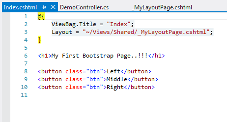
_MyLayoutPage.chtml. In
Index.chtml add html code like below.
Run the project a browse for
~Demo/Index. You'll see a page like below.
There are lot more components described in bootstrap's components
page. To understand complex controls add a new
Demo Action method and related view. In that view add following code.
The output page is looks like below.
But this is not a responsive layout yet. A responsive layout site is basically a website that is coded for any and every type of screen size. Most of the responsive layouts features are all handled with CSS, some a little more with the help of jQuery and/or javascript. There are three "main" screens it is for, a regular desktop computer screen, a tablet screen (iPad, Kindle), and a mobile device screen (iPhone, Android, etc.). We can have this feature with Bootstrap very easily.
To make
Demo.chtml, a responsive page, add
bootstrap-responsive.min.css file after the
bootstrap.min.css file. Then add
viewport meta tag anywhere inside head tag. This allows mobile browsers to fit the entire web page inside the virtual display. Users can then zoom in on interesting content. However, if you set the
viewport width to the actual device width, no zooming is required, because the content fits in the mobile browser.
Now the changed
_MyLayoutPage.chtml look like below.
You can have responsive layout experience by increasing and decreasing the browser width and height.
You can find the source code of this in
GitHub.